- Subject
- Microsoft 365 & SharePoint
- Filed
- Source
- Vesa Juvonen
- Loans
- 819
Microsoft Makes Copilot UX Components Generally Available with SPFx 1.24
SPFx 1.24 brings interactive web components into Microsoft Copilot. Check licensing, supported clients, hosting and React 18 upgrade requirements.
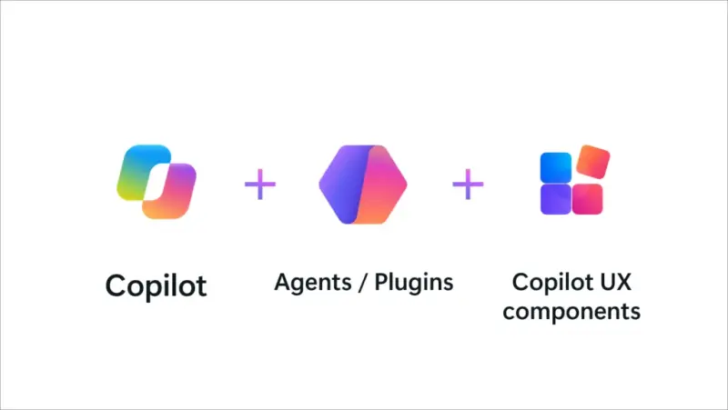
Teams can now put business dashboards, forms and actions directly in Microsoft Copilot conversations: Copilot UX components are generally available worldwide with SharePoint Framework (SPFx) 1.24. For IT teams, the release offers a way to surface existing business processes where employees ask for help, while SPFx handles component hosting and registration inside the customer’s Microsoft 365 tenant.
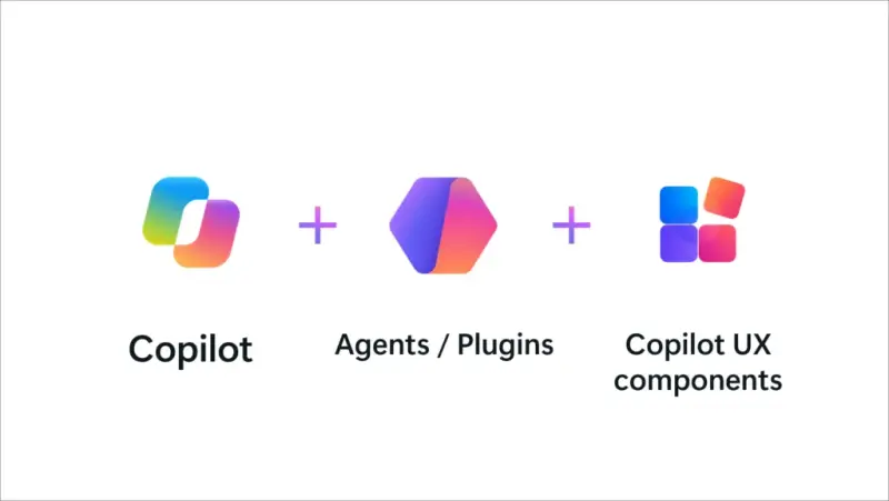
The practical change is a shorter path from an answer to a completed task. Instead of sending someone to a separate portal, an agent can display relevant information and controls in Copilot. Users can review details, make choices and confirm actions in context. A sales dashboard might include filters for exploring quarterly figures; a time-off form might show a leave balance, proposed dates and a Submit button together.
That workflow depends on a clear division of responsibility. Copilot interprets the request and surfaces a component. The organization’s code and connected systems provide business data, validation and operations. For consequential actions, the component should give the user a chance to review and confirm before sending changes through the relevant business system’s APIs.
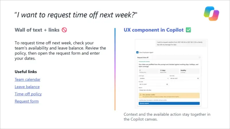
Interactive web experiences in the Copilot canvas
A Copilot UX component is a web experience that an agent can show in the Copilot canvas in response to a user’s intent. Developers choose how each component behaves and can support two display modes: inline for a quick interaction within the conversation, or full screen for tasks that need more room. Dashboards, maps, multi-step forms and detailed views are examples of experiences that can use the larger mode. Components can also adapt to Copilot’s light and dark themes.
Microsoft describes the model as open to React or JavaScript components, including charts, grids, maps, wizards and existing design systems. React is used in many examples, but it isn’t required. Teams can use the framework and libraries that suit their project, then decide what each component renders in its available modes.
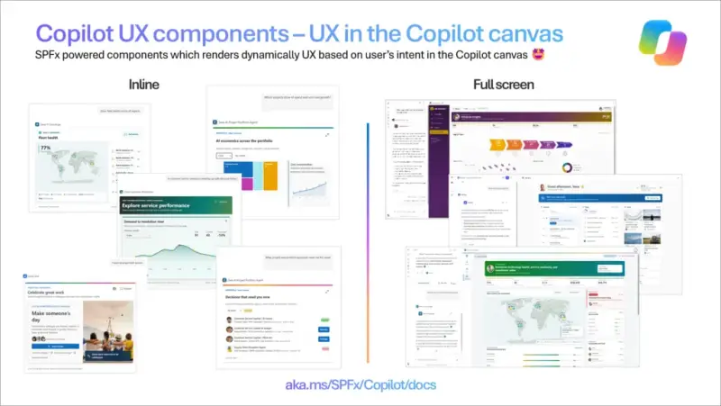
This gives teams room to match the interface to the work. A short approval may fit inline; a more involved review may benefit from a full-screen workspace. In both cases, the intended benefit is to keep the task alongside the conversation that prompted it.
Where organizations can apply it
The feature is aimed at processes that already run through portals, forms, dashboards or line-of-business applications. Microsoft lists possible uses across several areas:
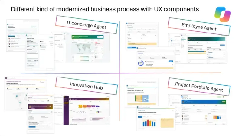
- Business data, including sales dashboards, customer views, stock levels, expenses and pay slips.
- Employee services, such as time off, help desk requests, travel booking, onboarding tasks and recognition.
- Personal dashboards for relevant news, current tasks and a view of the day.
- Governance and operations, including site provisioning, policy checks and site dashboards, with an administrator confirming each step.
Organizations can bring selected parts of these workflows into Copilot while continuing to use their existing business logic, APIs and web development skills. That makes the feature relevant to teams looking to improve access to a process without starting its underlying implementation from scratch.
Microsoft also points to the existing SPFx ecosystem: customer- and partner-built solutions serve tens of millions of end users each day across tens of thousands of organizations worldwide, according to the company. Partners can package repeatable scenarios as Copilot-ready solutions rather than recreate the same workflow for each customer.
SPFx handles component hosting in the tenant
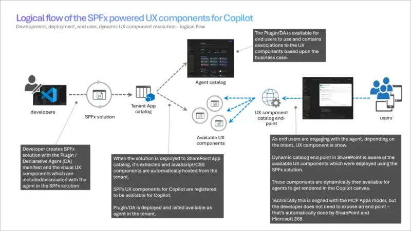
The hosting model is a key operational detail. An SPFx solution package includes the agent and its Copilot UX components. After deployment, Microsoft 365 hosts the component’s JavaScript and CSS in the customer’s tenant. The platform also registers and routes the components for Copilot, so teams don’t need to build a separate component web server or expose and maintain an endpoint for them.
Components use the signed-in user’s identity and permissions through built-in single sign-on. That can avoid a separate sign-in prompt, while access to business information continues to depend on the user’s permissions. Connected business APIs still need to be addressed in the solution’s configuration: the deployment model doesn’t remove requirements for permissions or consent where those APIs need them.
In Microsoft’s comparison, an externally hosted MCP App requires the development team to deploy, secure, scale and operate a web app and endpoint, and to implement authentication. Copilot UX components use SPFx for hosting, registration and routing in the tenant. Teams therefore have no separate component-hosting infrastructure to patch, monitor or scale.
The distinction matters for data architecture as well. Component assets are hosted in Microsoft 365, while connected data sources remain part of the solution architecture. Teams still need to review which business APIs a component calls and what access those connections require. The feature reduces hosting work for the component itself; it doesn’t replace that API and permissions review.
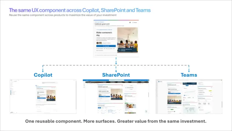
One package across environments and Microsoft 365
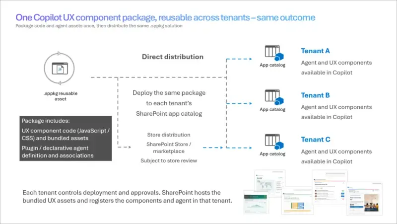
The same SPFx solution package can move through development, test and production tenants. Partners and independent software vendors can also deploy a packaged solution to multiple customer tenants, with each deployment running under that customer’s governance. SPFx removes the need to run a separate component web server for each customer.
At general availability, Copilot UX components are supported in SPFx solutions available through the SharePoint Store. A single solution packages the declarative agent and its components together.

The web code can also support other Microsoft 365 surfaces when they fit the workflow: as a web part in SharePoint, a tab in Microsoft Teams, or an app opened from Outlook’s left navigation in full-page view. In Copilot, components can appear inline or full screen. The immediate GA use case is putting task controls next to the conversation that prompted the work.
Availability, licensing and supported clients
Copilot UX components are generally available worldwide with SPFx 1.24. Users need a Microsoft Copilot add-on license to use them in Copilot. For users without the required license, components won’t render and a message explains the license requirement.

Using Copilot UX components doesn’t itself incur consumption-based charges. However, a component may call a consumption-based API, such as Work IQ, and charges for that API may apply.
At GA, supported clients are Microsoft Copilot in the browser and on desktop. Components also work when users access Copilot through Microsoft Teams in both browser and desktop. Android and iOS support is planned, along with support for Cowork and additional Copilot surfaces.
Microsoft also plans support for packaging agents and components with the new Copilot plug-in model. The stated goal is to let components appear directly in standard Copilot chat without switching to a specific agent, subject to the organization’s configuration. This remains planned work, rather than part of the GA availability described for SPFx 1.24.
Development changes in SPFx 1.24
SPFx 1.24 makes Copilot UX components production-ready and updates the development platform. New solutions use React 18.x by default, and Node.js 24 and Node.js 26 are supported for SPFx development.
For components, the release adds a predictable default display mode in the Copilot canvas, automatic Teams manifest version updates to avoid version conflicts when updating a component, and build-time validation for declarative agent manifests. Newly scaffolded components use declarative agent manifest v1.8. Microsoft also included fixes based on preview feedback and updates addressing npm audit findings.
Teams that built against the 1.24 preview releases should update to the GA version. Existing solutions moving to React 18 should be tested, with Microsoft’s React 18 upgrade guidance covering common upgrade paths and third-party library considerations. The SPFx 1.24 release notes provide the release details.
Build and test a first component
Teams can start with a ready-to-deploy scenario sample. The samples include solution packages, demo data and setup steps, letting developers see how an interactive experience works in Copilot before adapting a process of their own.
The documented build sequence starts by installing the SPFx generator:
npm install @microsoft/generator-sharepoint@latest --global
From there, developers scaffold a Copilot UX component using the Minimal, No framework or React template, then run and test it locally in Copilot Workbench. The Workbench supports debugging across inline and full-screen modes, light and dark themes, and different input properties. After local testing, the team deploys the package to its tenant and surfaces it in Copilot.
Microsoft’s getting started tutorial and video guide walk through creating a first component. Developers can also use the sample gallery and documentation. The project structure is compatible with coding assistants for scaffolding, building, refactoring and troubleshooting, while developers remain responsible for the interface and its business behavior.
Microsoft says the GA release follows customer and partner feedback during the preview. Earlier materials used the names SharePoint Copilot Apps and Copilot Components; the current product name is Copilot UX components. SPFx 1.25 is planned for December 2026 or January 2027, with follow-up releases intended to evolve the model based on feedback. Teams adopting the GA release can begin with a familiar task that people already discuss with Copilot, then check licensing, client support, API access and the React 18 implications before deployment.